The Latest News
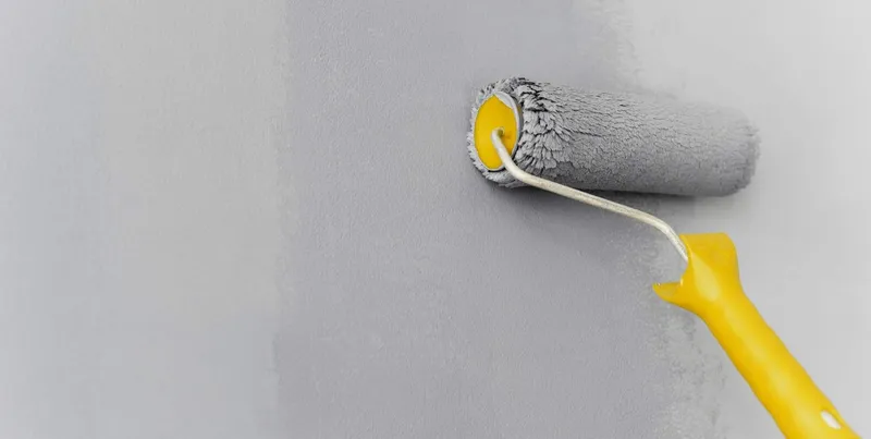
How to Get the Most Out of Neutral Paint
June 1, 2022
A generic neutral paint can help you add color and character to a bland space. However, you can do a lot more with a product by Sherwin Williams because this brand manufactures thick paints that require fewer coats.
Sherwin Williams' selection of paints spans the color spectrum. In order to pick the right paint, you must understand the principles of neutral colors.
The Essence of Neutral Shades
Neutral paints by all brands have undertones. Some undertones are rich and warm, and others are calm and cool. Grays, greens, and blues are cool undertones, and yellow hues and brown shades are warm tones. A neutral paint with warm undertones will engage your senses, but a paint with cool tones will calm your senses.
Fantastic Paint Recommendations - 7 Neutral Paints by Sherwin Williams
REPOSE GRAY
Repose Gray is a warm shade with soft taupe and green undertones. It's a great color for any space in a home.
ACCESSIBLE BEIGE
This shade of beige is a member of the greige family. It has faint yellow and gray undertones.
ALPACA
Alpaca is warmer than a regular shade of gray. Unlike other neutral tones, this color is very rustic and rich like taupe.
AGREEABLE GRAY
Agreeable Gray is a wonderful color for a well-lit space. It has nice undertones and a balanced hue.
SILVERPOINTE GRAY
A nice light grey with more cool undertones. It can add a layer of depth to a bland space.
SNOWBOUND
Snowbound is a white shade with gray undertones. You can pair it with other neutral tones.
ALABASTER
Alabaster is a soft shade that blends gray with white. It has beige undertones, but it's technically off-white.
How to Decorate a Space with Neutral Colors
There are a few ways to decorate a space with neutral tones. If you're a big fan of light paint, you could make your favorite shade a focal point in any space. However, if you're aiming for an all-neutral color palette, you'll have to incorporate complementary tones because these colors will create contrast. Without contrast, an all-neutral color palette will appear flat.
You could also decorate a space by incorporating two colors on the opposite ends of the color spectrum. A good example is a white wall with a black trim. You could also integrate two colors that have a similar tone like charcoal and blue.
The final idea is a neutral backdrop. It's a smart design strategy because it's practical, cost-effective, and rewarding. You can create one over a fireplace or directly behind your furniture.
When used correctly, a neutral paint color can totally transform the look of a home. If you're currently searching for a home to decorate and make your own, reach out to us to get started!
Latest News
Reasons to Build Local
June 17, 2026
Rising Interest Rates: Don't Let the Market Timing Game Fool You
October 25, 2024
Living in Downtown Des Moines
October 3, 2022
Important Tips for Buying a Home in Iowa
August 10, 2022
Celebrating Pride Fest 2022
June 7, 2022
Hot Spot: West Des Moines is THE Place To Be!
June 1, 2022
5 Tips for Enjoying Your Outdoor Space this Spring
June 1, 2022
Tips for Relocating
June 1, 2022
Search for Homes Easier and Faster Using an Online Sales Counselor
June 1, 2022

Awards & Accolades
We believe in creating a new standard for homes in Des Moines, and we're glad to see that others agree we provide the very best homebuilding experience.

2016 Best Home Builder

2017 Best Home Builder

2018 Best Home Builder
2019 Best Home Builder
The whole process from purchase to construction was very smooth. Everyone was helpful. If there were any problems, they were taken care of right away and all my questions were answered. Superintendent Greg was great to work with. I really like the layout of my house.